Branding
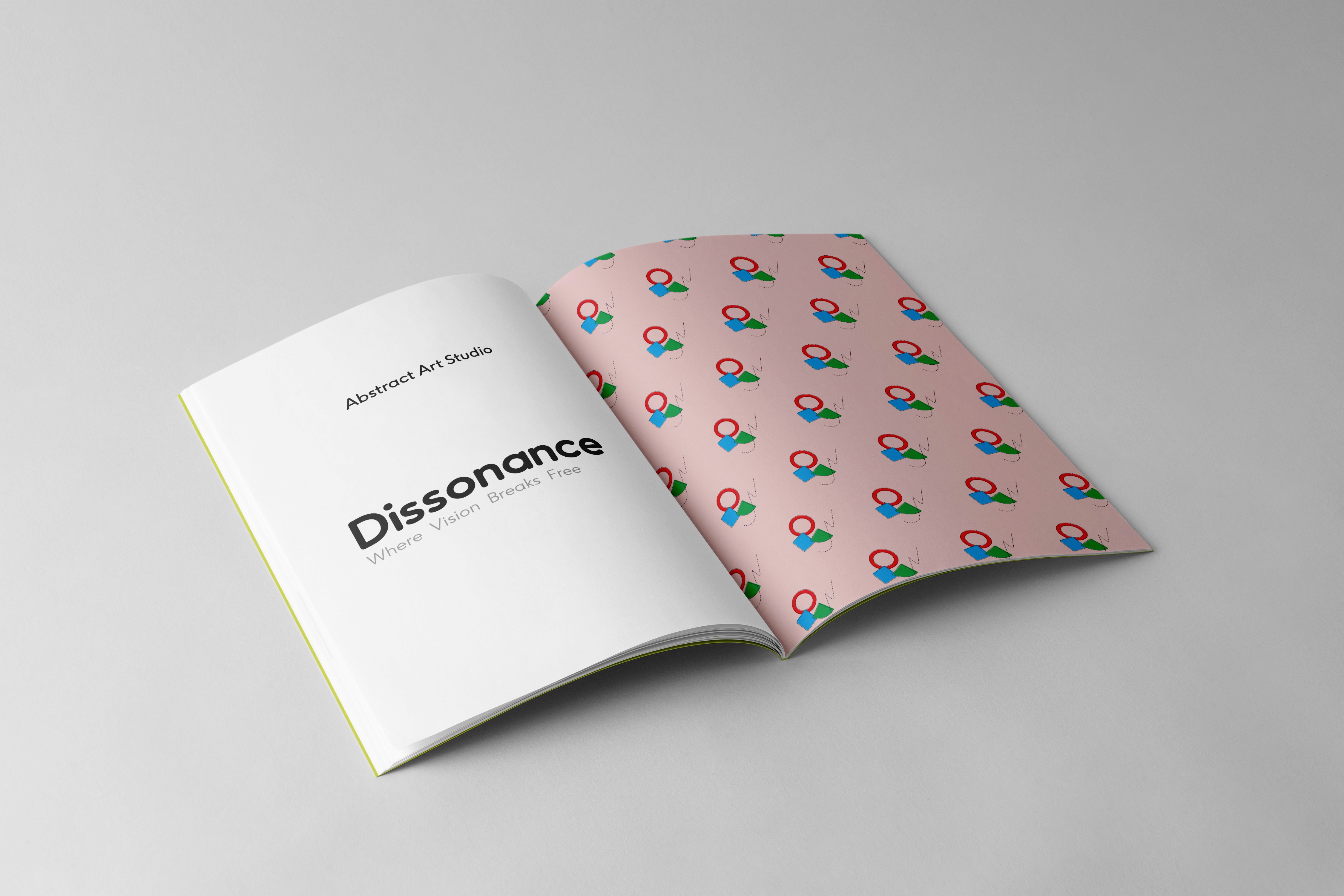
Dissonance
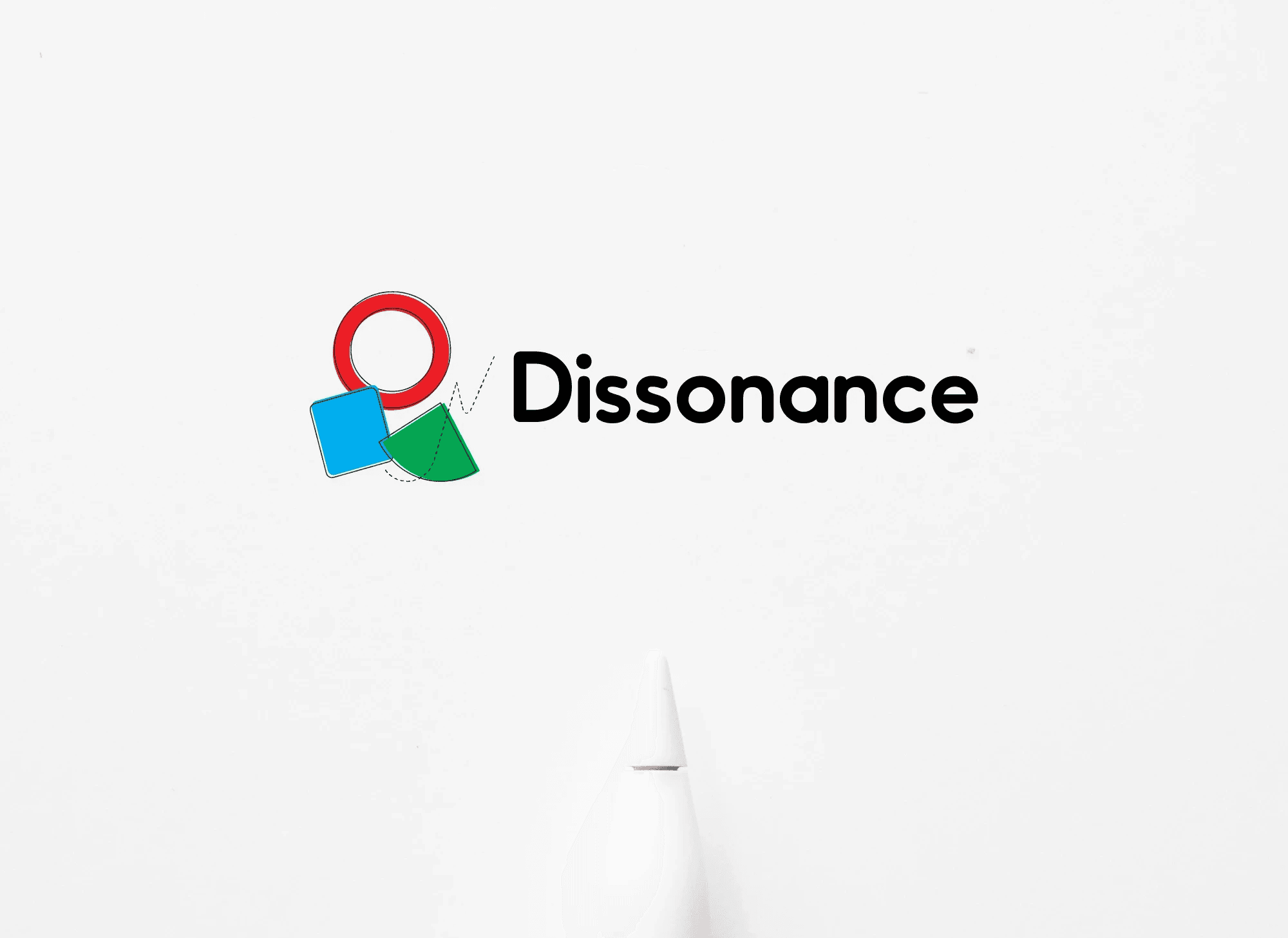
Dissonance is an abstract art brand that thrives on irregularity and creative tension. The identity reflects asymmetry, imperfect shapes, and unexpected harmony, making everyday items artistic statements.
Year :
2025
Industry :
Abstract Art / Home & Lifestyle
Client :
Dissonance Studio
Project Duration :
7 Days
Problem :
Most lifestyle and decor brands rely on repetitive, uniform patterns that lack individuality. Customers seeking something bold, thought-provoking, and conversation-worthy often find limited options that reflect true artistic irregularity.
Solution :
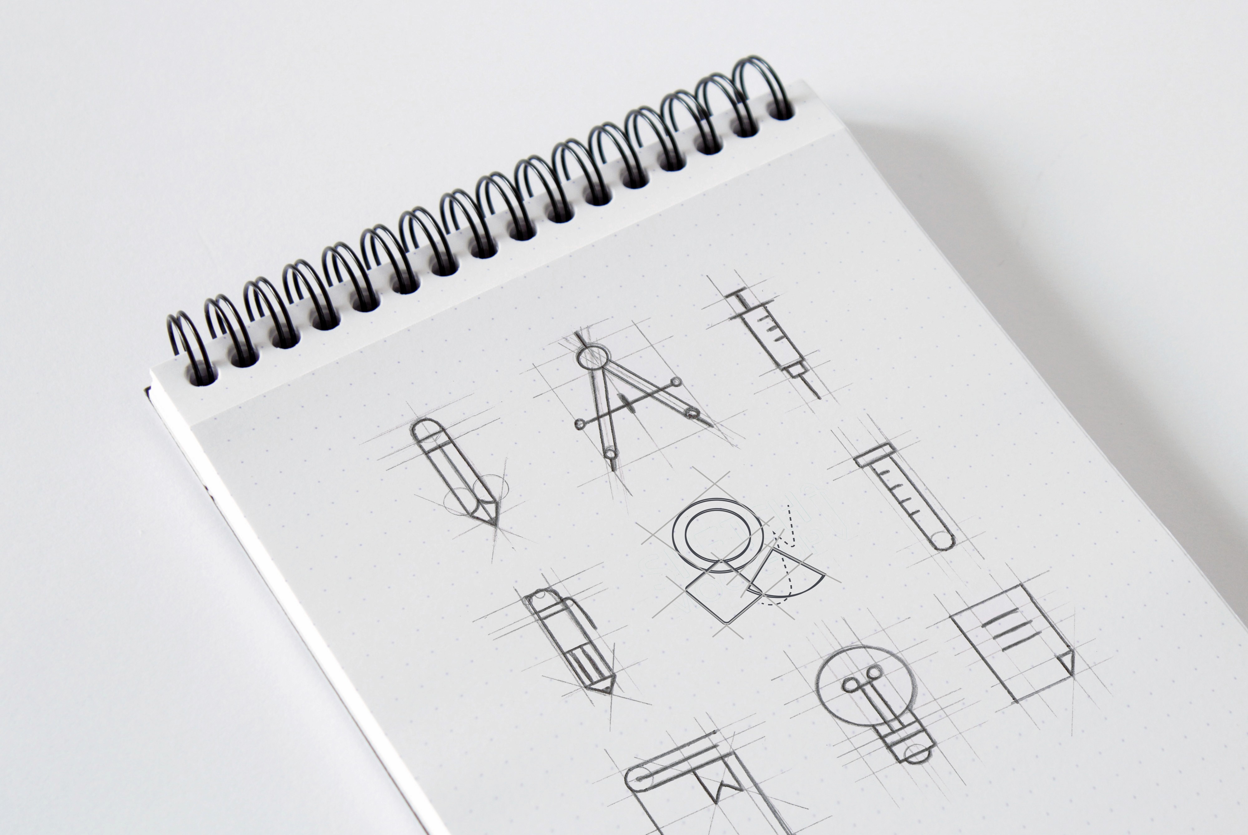
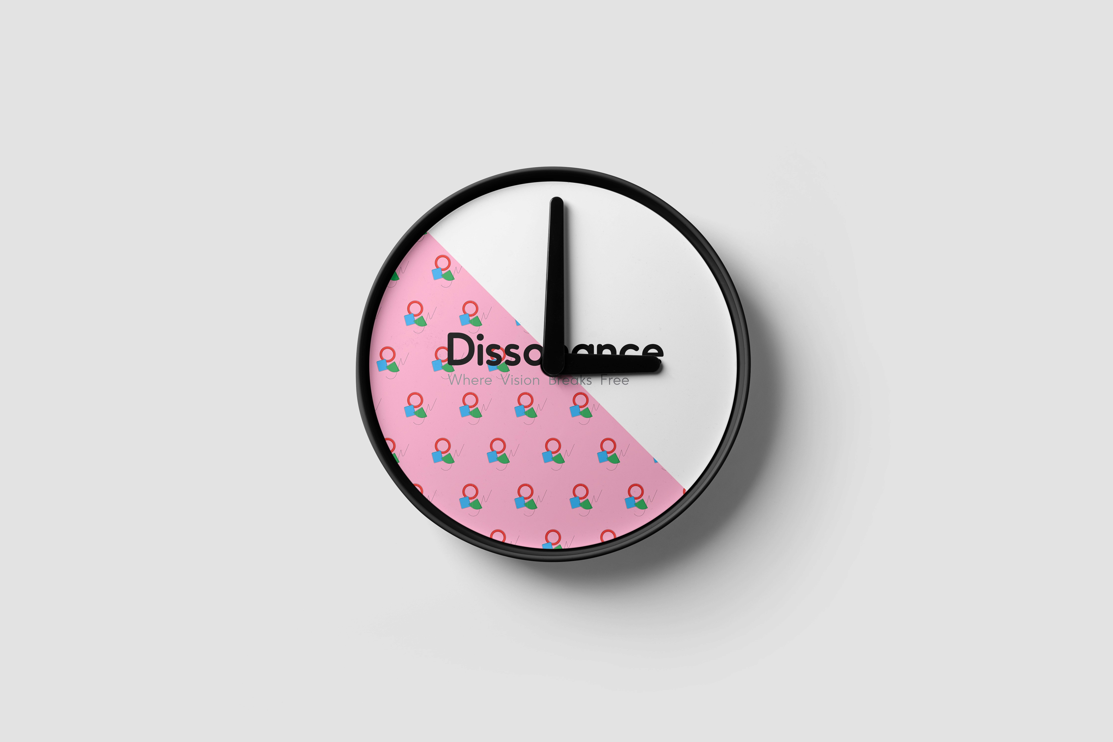
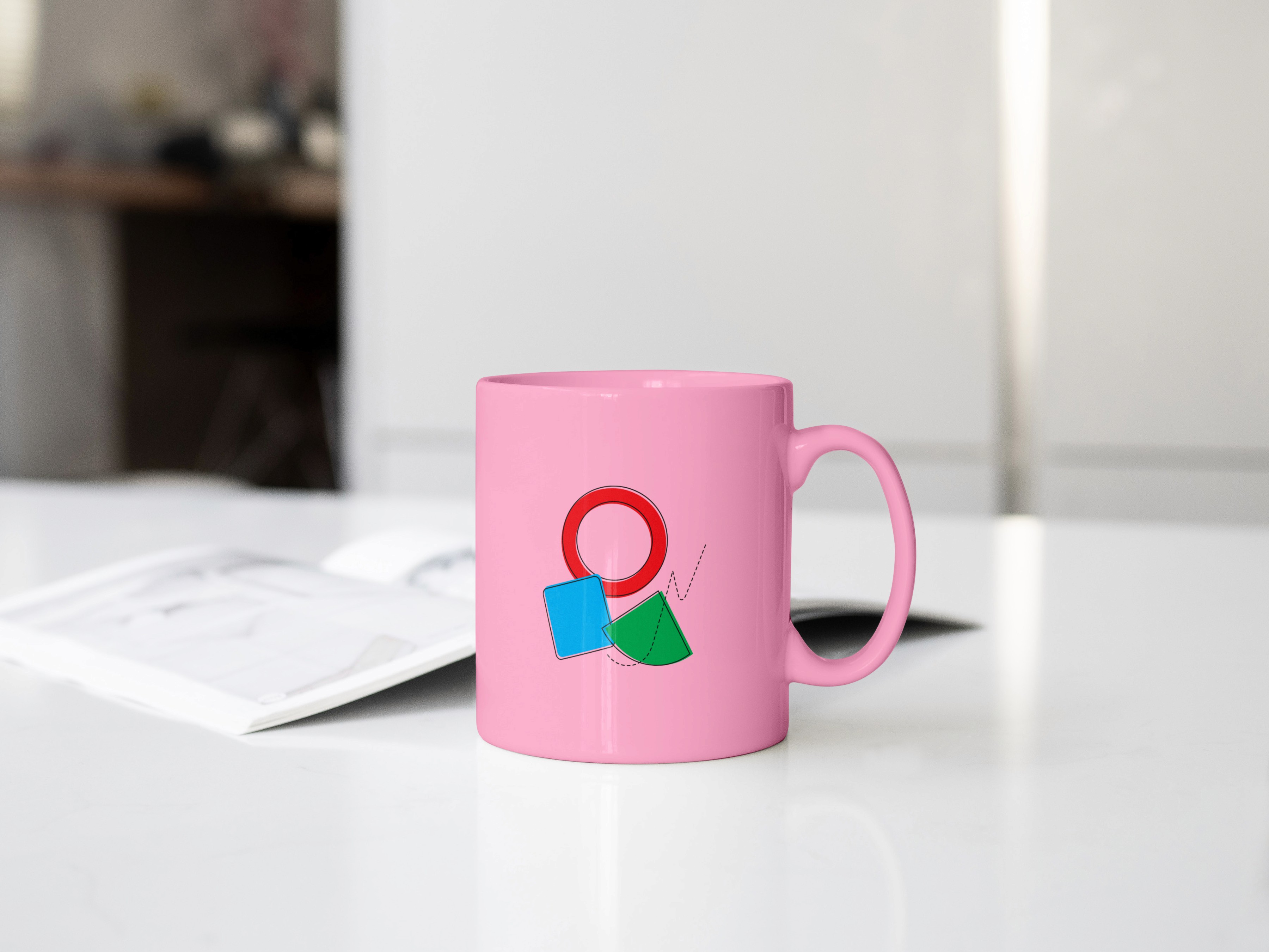
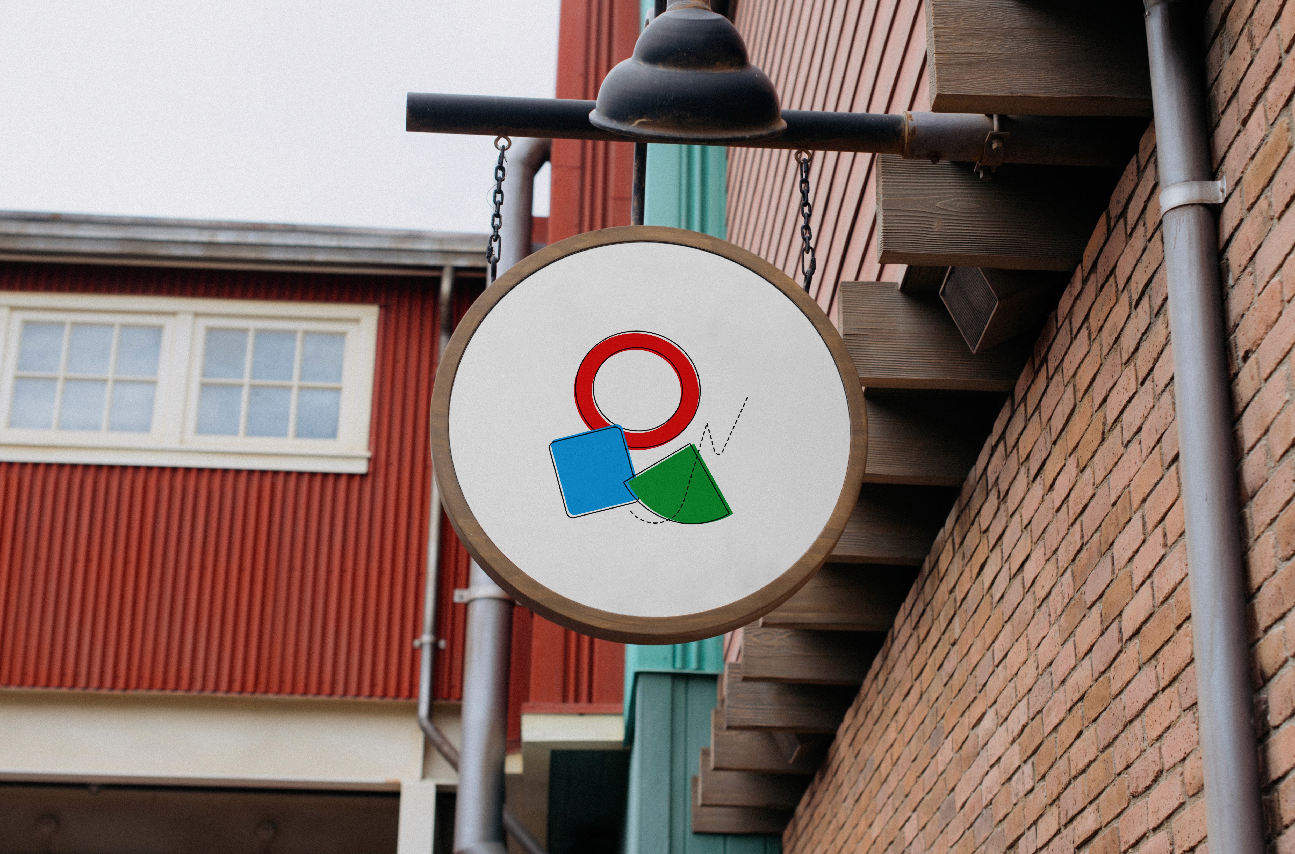
Dissonance embraces abstract imperfection. The logo itself is a composition of irregular shapes — a hollow circle, an uneven line, a rounded square, and a triangular form resembling a softened slice — symbolizing contrast and unity. The brand extends into lifestyle products like mugs, pillows, clocks, gift wraps, and booklets, turning ordinary objects into living pieces of art.
Challenge :
The challenge was to balance irregularity with coherence. Too much distortion risked making the brand feel chaotic, while too much uniformity defeated the purpose. The design process required carefully harmonizing the irregular shapes into a visual language that was abstract yet approachable.
Summary :
Dissonance transforms everyday items into abstract experiences. By celebrating imperfection, the brand offers a refreshing alternative to traditional lifestyle aesthetics, appealing to audiences who find beauty in the unexpected.
More Projects
Branding
Dissonance
Dissonance is an abstract art brand that thrives on irregularity and creative tension. The identity reflects asymmetry, imperfect shapes, and unexpected harmony, making everyday items artistic statements.
Year :
2025
Industry :
Abstract Art / Home & Lifestyle
Client :
Dissonance Studio
Project Duration :
7 Days
Problem :
Most lifestyle and decor brands rely on repetitive, uniform patterns that lack individuality. Customers seeking something bold, thought-provoking, and conversation-worthy often find limited options that reflect true artistic irregularity.
Solution :
Dissonance embraces abstract imperfection. The logo itself is a composition of irregular shapes — a hollow circle, an uneven line, a rounded square, and a triangular form resembling a softened slice — symbolizing contrast and unity. The brand extends into lifestyle products like mugs, pillows, clocks, gift wraps, and booklets, turning ordinary objects into living pieces of art.
Challenge :
The challenge was to balance irregularity with coherence. Too much distortion risked making the brand feel chaotic, while too much uniformity defeated the purpose. The design process required carefully harmonizing the irregular shapes into a visual language that was abstract yet approachable.
Summary :
Dissonance transforms everyday items into abstract experiences. By celebrating imperfection, the brand offers a refreshing alternative to traditional lifestyle aesthetics, appealing to audiences who find beauty in the unexpected.