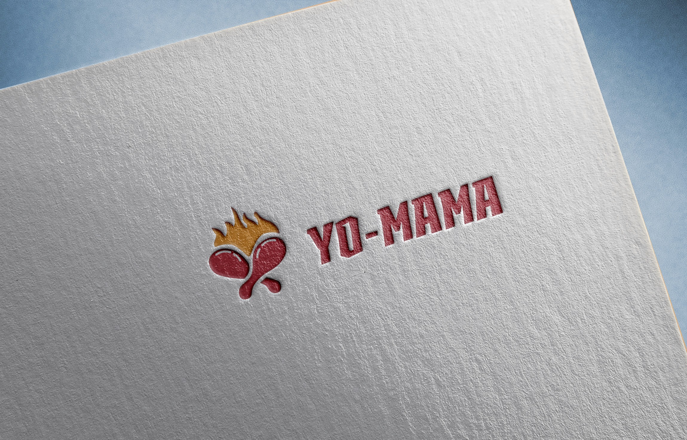
Branding
YO-MAMA
A fun, vibrant fast-food brand that serves personality as generously as flavor.
Year :
2025
Industry :
Food
Client :
YO-MAMA
Project Duration :
5 Days
Problem :
YO-MAMA wanted to stand out in the crowded fast food market with an identity that felt bold, playful, and instantly recognizable. The challenge was how to create something energetic without overwhelming the brand’s usability across menus, packaging, and signage.
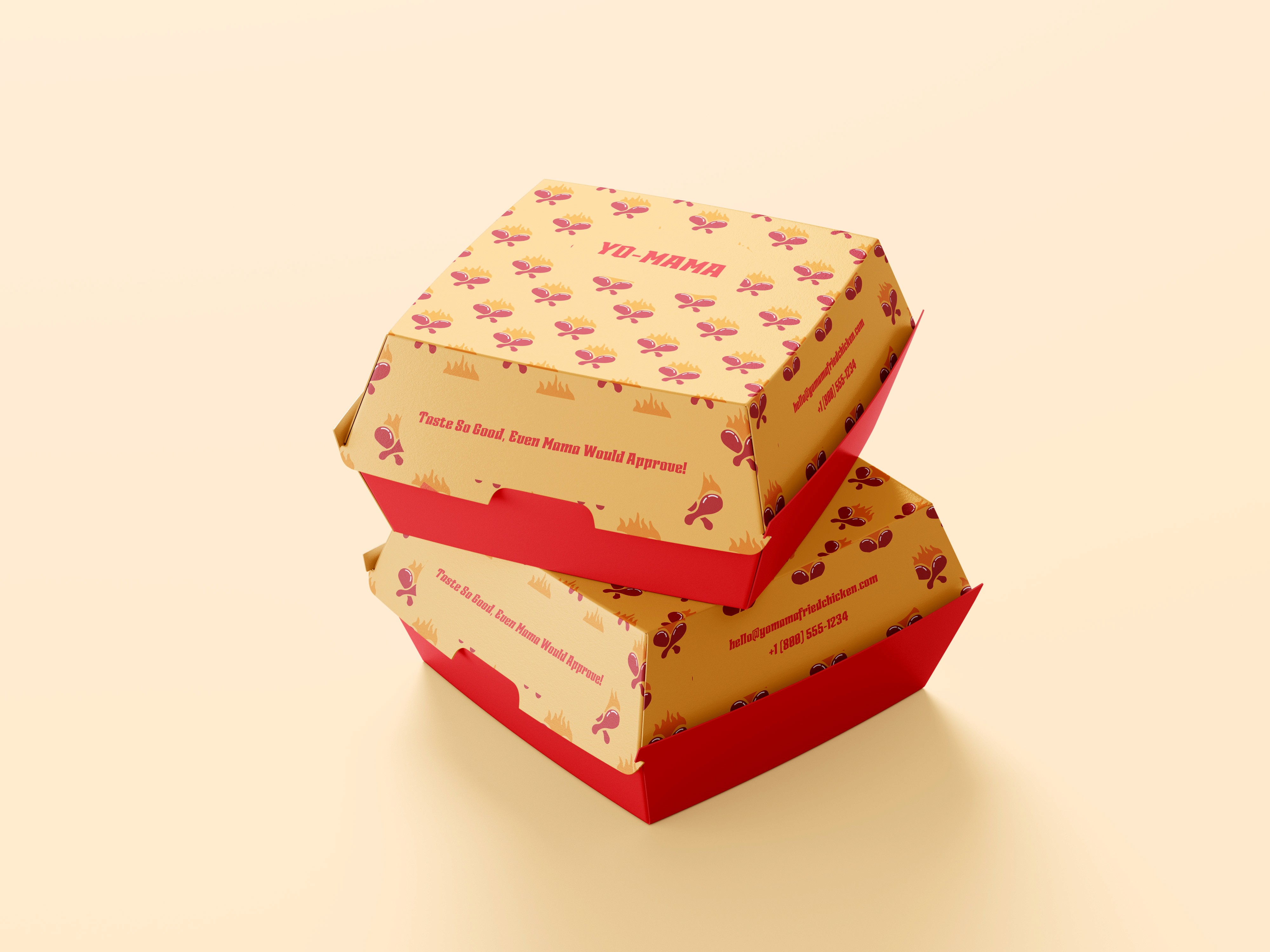
Solution :
The design featured vibrant typography with a quirky character that brought humor and personality into the brand. Bright, energetic colors reflected the fun and boldness of the name, making the identity instantly engaging and approachable.

Challenge :
The main challenge was striking the right balance between humor and professionalism. While the name itself was playful, the brand still needed to be taken seriously by customers. Achieving this balance required refining the design until it felt fun but still polished.
Summary :
The final brand identity for YO-MAMA is energetic, bold, and full of personality. It positions the fast food chain as approachable and fun, while maintaining a professional look that works across packaging, menus, and digital presence.

More Projects


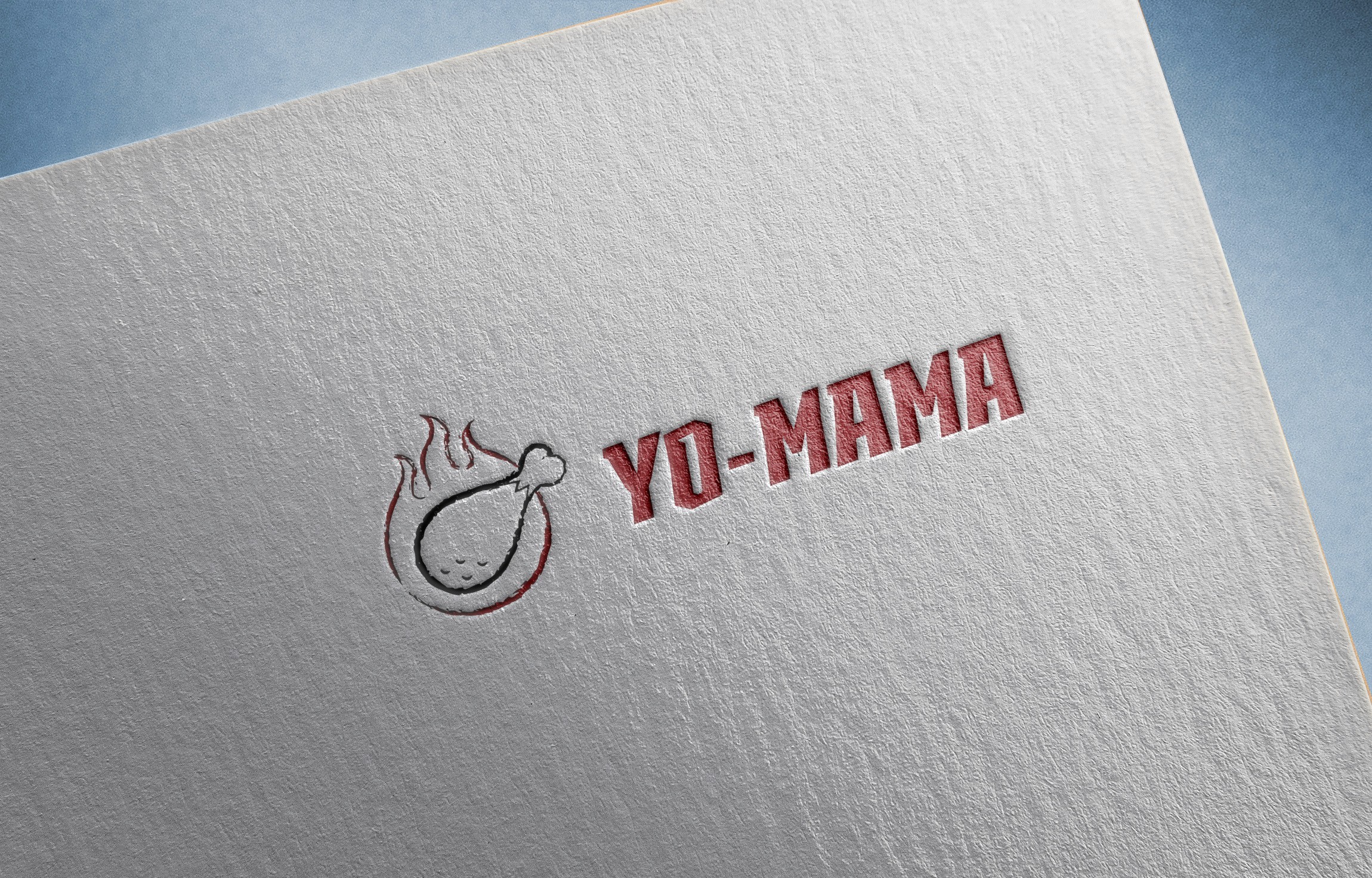
Branding
YO-MAMA
A fun, vibrant fast-food brand that serves personality as generously as flavor.
Year :
2025
Industry :
Food
Client :
YO-MAMA
Project Duration :
5 Days
Problem :
YO-MAMA wanted to stand out in the crowded fast food market with an identity that felt bold, playful, and instantly recognizable. The challenge was how to create something energetic without overwhelming the brand’s usability across menus, packaging, and signage.
Solution :
The design featured vibrant typography with a quirky character that brought humor and personality into the brand. Bright, energetic colors reflected the fun and boldness of the name, making the identity instantly engaging and approachable.
Challenge :
The main challenge was striking the right balance between humor and professionalism. While the name itself was playful, the brand still needed to be taken seriously by customers. Achieving this balance required refining the design until it felt fun but still polished.
Summary :
The final brand identity for YO-MAMA is energetic, bold, and full of personality. It positions the fast food chain as approachable and fun, while maintaining a professional look that works across packaging, menus, and digital presence.
More Projects
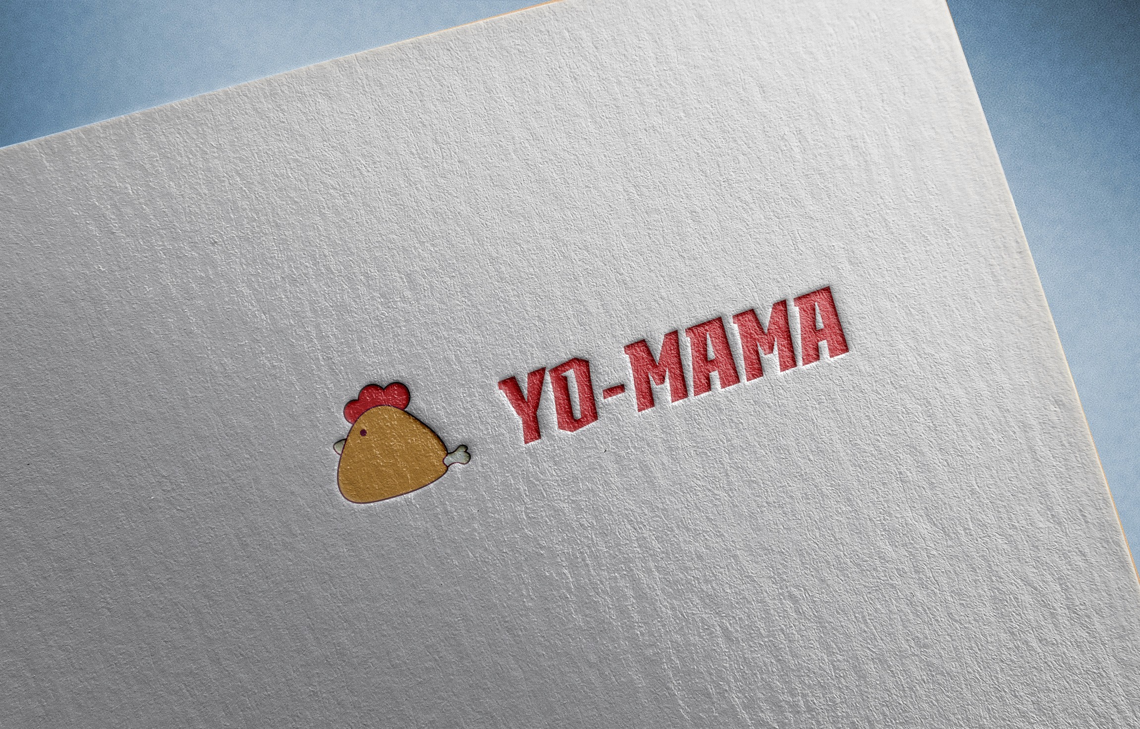
Branding
YO-MAMA
A fun, vibrant fast-food brand that serves personality as generously as flavor.
Year :
2025
Industry :
Food
Client :
YO-MAMA
Project Duration :
5 Days
Problem :
YO-MAMA wanted to stand out in the crowded fast food market with an identity that felt bold, playful, and instantly recognizable. The challenge was how to create something energetic without overwhelming the brand’s usability across menus, packaging, and signage.
Solution :
The design featured vibrant typography with a quirky character that brought humor and personality into the brand. Bright, energetic colors reflected the fun and boldness of the name, making the identity instantly engaging and approachable.
Challenge :
The main challenge was striking the right balance between humor and professionalism. While the name itself was playful, the brand still needed to be taken seriously by customers. Achieving this balance required refining the design until it felt fun but still polished.
Summary :
The final brand identity for YO-MAMA is energetic, bold, and full of personality. It positions the fast food chain as approachable and fun, while maintaining a professional look that works across packaging, menus, and digital presence.