Branding
Jiggly Pop
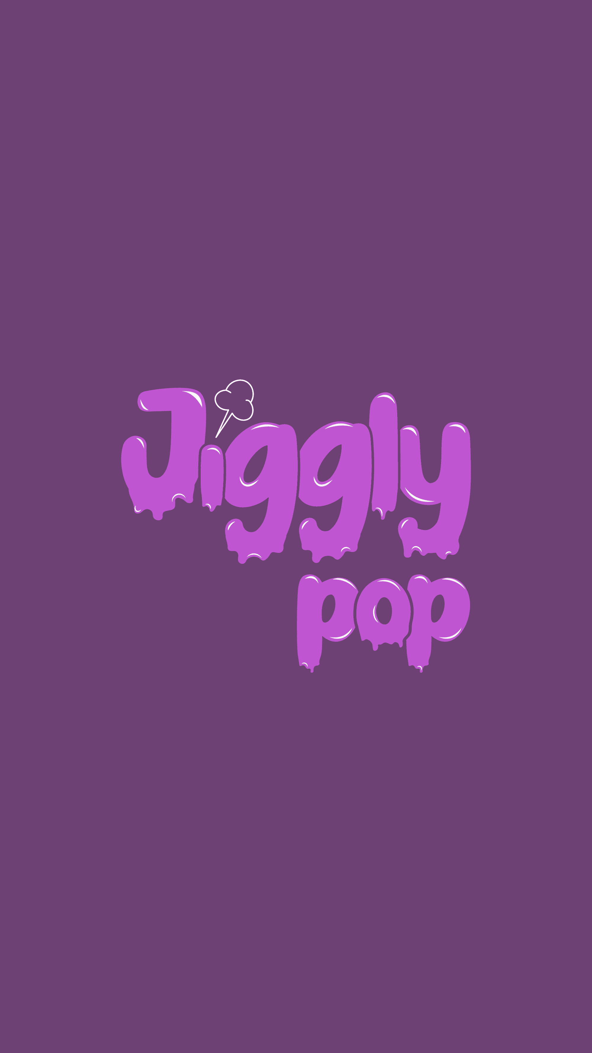
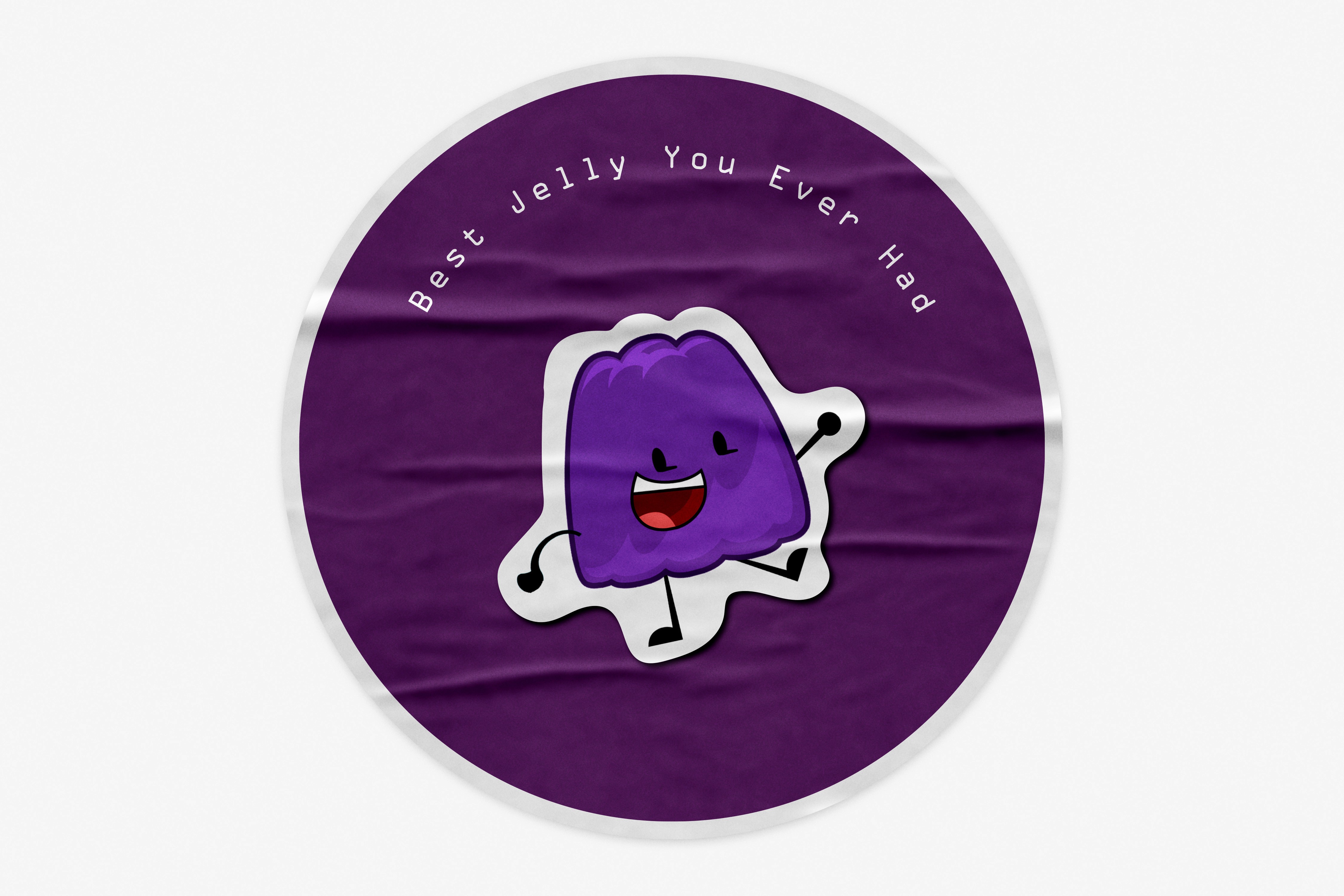
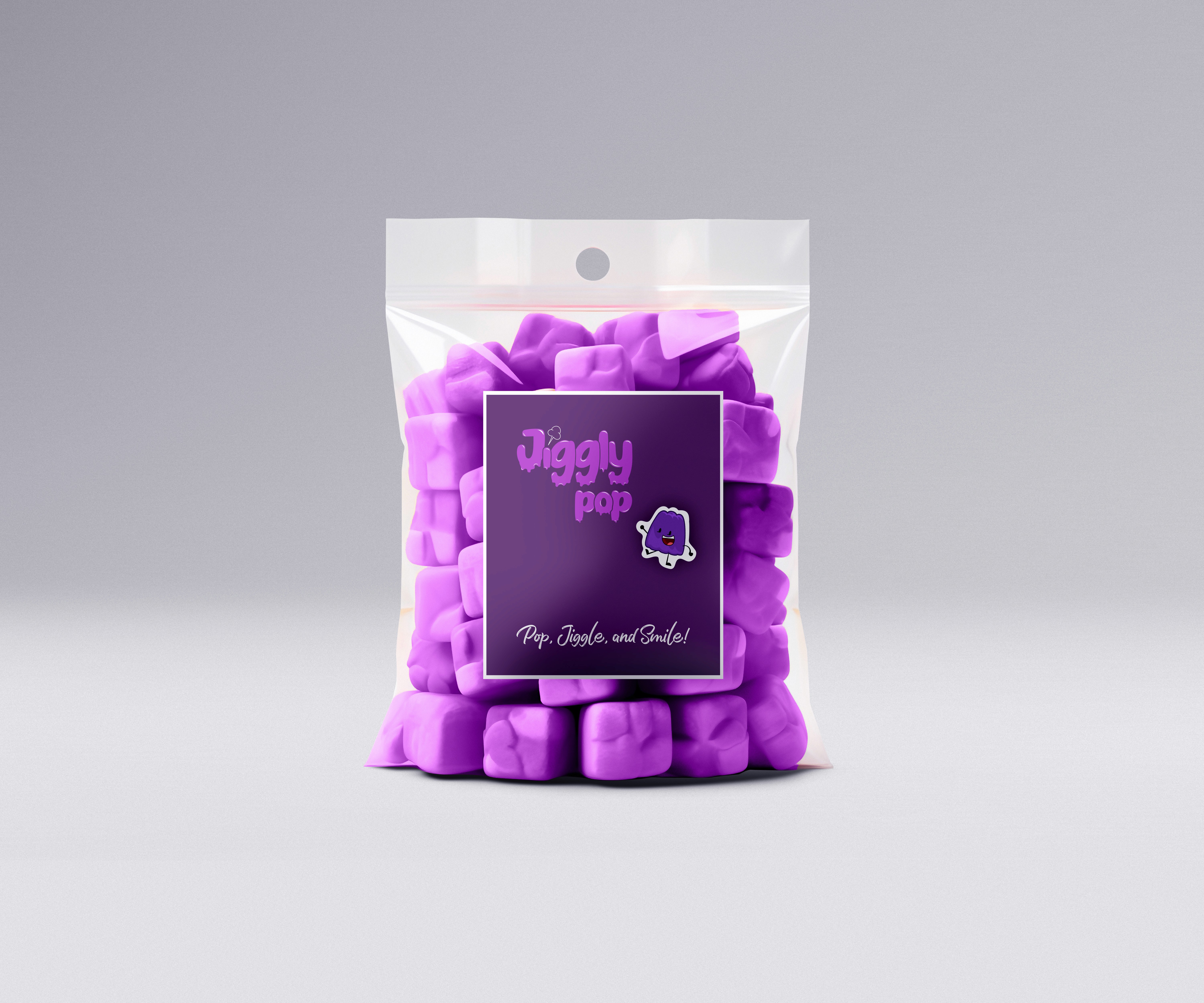
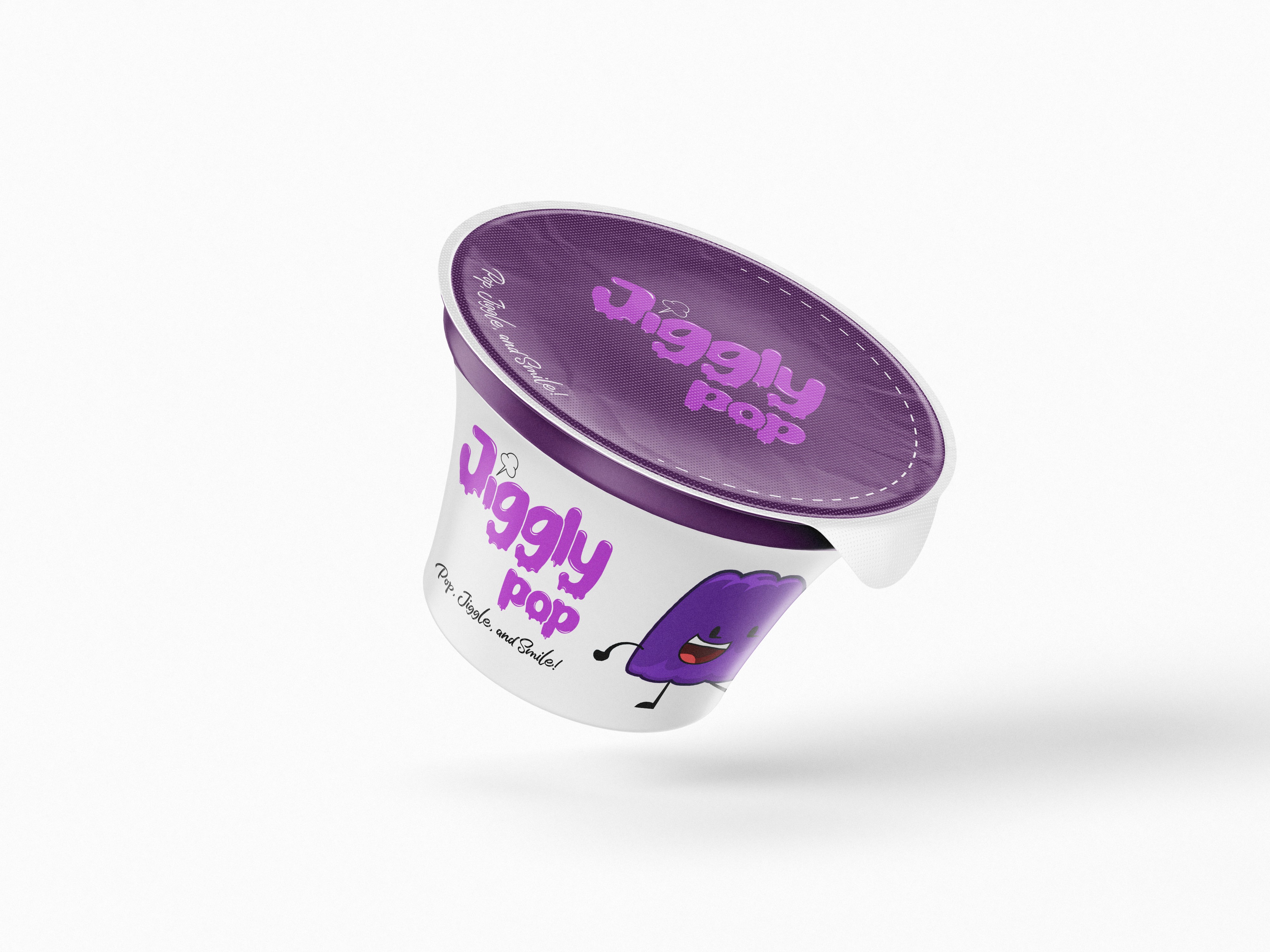
Jiggly Pop is a playful candy brand built around fun, color, and sweetness. Its identity is centered on a vibrant purple theme, a melting-effect logo, and a cheerful mascot, creating a joyful and memorable experience for candy lovers.
Year :
2024
Industry :
Confectionery / FMCG
Client :
Jiggly Pop
Project Duration :
6 Days
Problem :
The confectionery market is saturated with candy brands that often look and feel the same. Jiggly Pop needed a bold, engaging identity that would instantly stand out on shelves, connect with younger audiences, and communicate the brand’s fun, jiggly personality.
Solution :
We crafted a vibrant and playful visual identity where everything reflects the brand’s spirit:
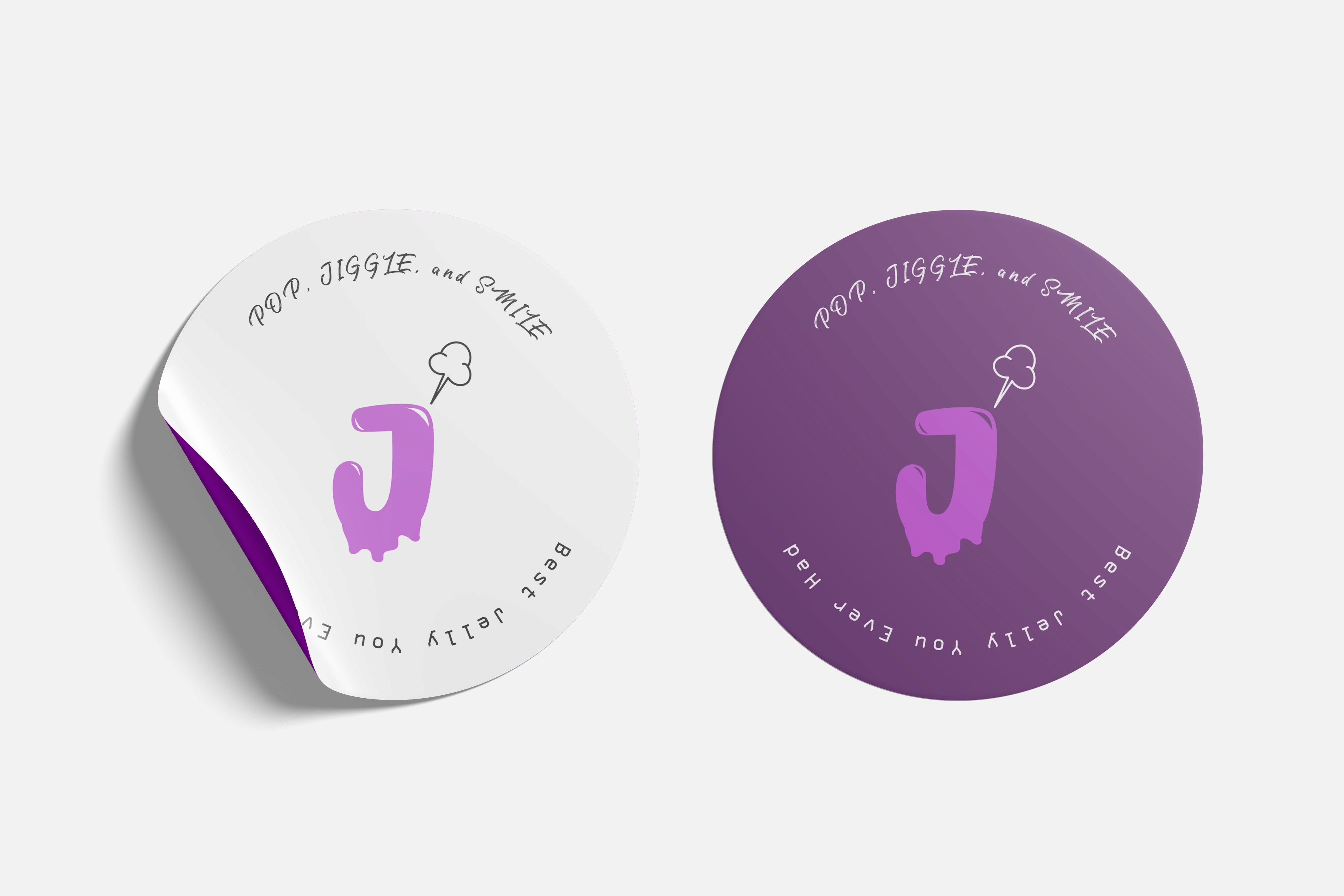
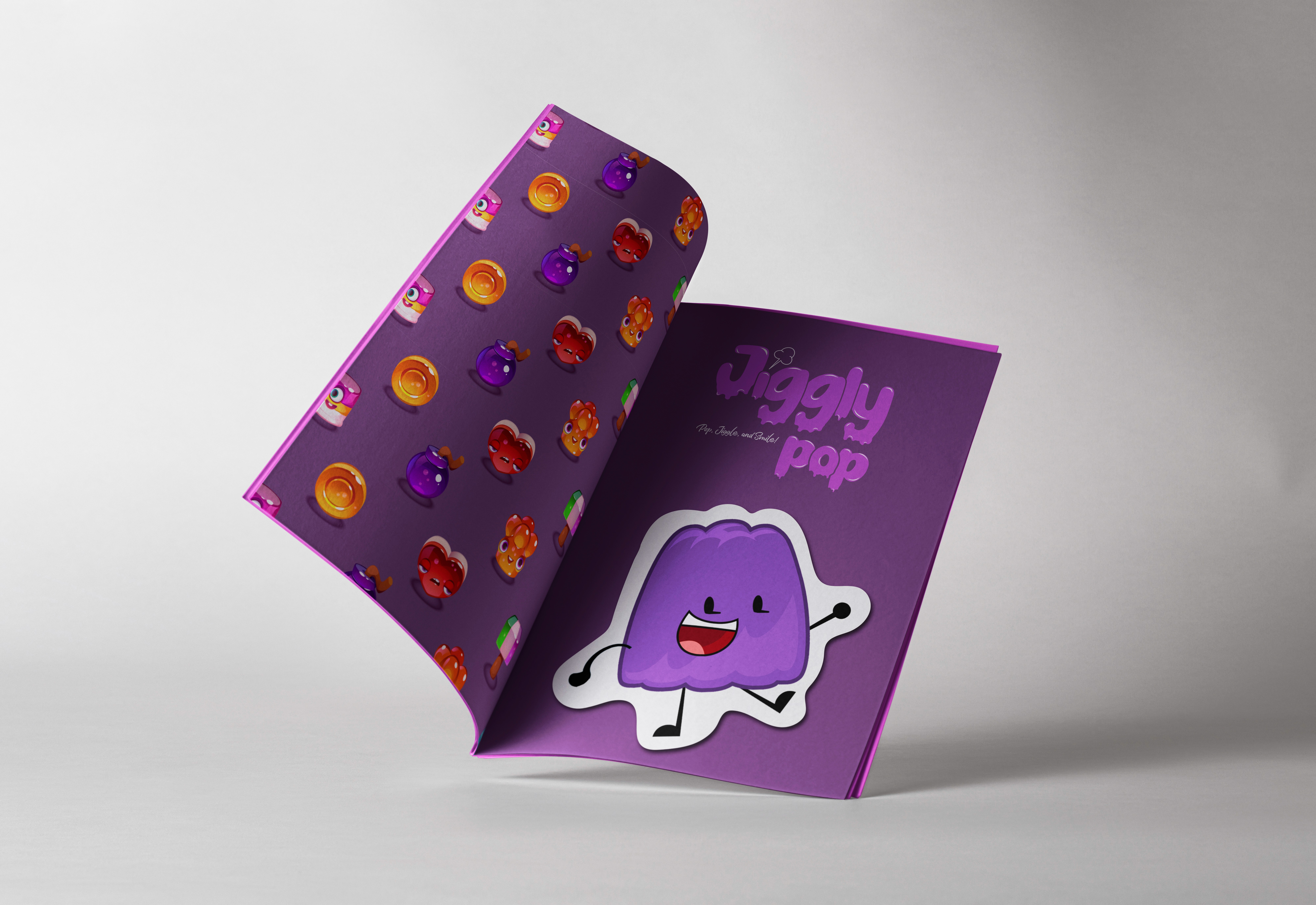
Logo: A melting effect typeface symbolizing soft marshmallows and melting candy.
Color Palette: A dominant purple shade to make the brand distinctive and instantly recognizable.
Packaging & Stickers: Fun and appealing visuals that strengthen the brand’s playful tone.
Booklet: A compact brand guide to unify communication across platforms.
Mascot: A friendly character that embodies Jiggly Pop’s joy and creates a personal bond with customers.
Challenge :
The main challenge was balancing playfulness with readability and brand clarity. The melting effect had to look fun without making the logo hard to read. Another challenge was ensuring that all collateral — from packaging to mascots — maintained consistency while still appealing to both kids and parents.
Summary :
Within six days, Jiggly Pop was transformed into a vibrant, memorable candy brand. The combination of a playful logo, strong purple identity, fun packaging, stickers, mascot, and booklet created a cohesive system that sets Jiggly Pop apart in the crowded confectionery space.
More Projects
Branding
Jiggly Pop
Jiggly Pop is a playful candy brand built around fun, color, and sweetness. Its identity is centered on a vibrant purple theme, a melting-effect logo, and a cheerful mascot, creating a joyful and memorable experience for candy lovers.
Year :
2024
Industry :
Confectionery / FMCG
Client :
Jiggly Pop
Project Duration :
6 Days
Problem :
The confectionery market is saturated with candy brands that often look and feel the same. Jiggly Pop needed a bold, engaging identity that would instantly stand out on shelves, connect with younger audiences, and communicate the brand’s fun, jiggly personality.
Solution :
We crafted a vibrant and playful visual identity where everything reflects the brand’s spirit:
Logo: A melting effect typeface symbolizing soft marshmallows and melting candy.
Color Palette: A dominant purple shade to make the brand distinctive and instantly recognizable.
Packaging & Stickers: Fun and appealing visuals that strengthen the brand’s playful tone.
Booklet: A compact brand guide to unify communication across platforms.
Mascot: A friendly character that embodies Jiggly Pop’s joy and creates a personal bond with customers.
Challenge :
The main challenge was balancing playfulness with readability and brand clarity. The melting effect had to look fun without making the logo hard to read. Another challenge was ensuring that all collateral — from packaging to mascots — maintained consistency while still appealing to both kids and parents.
Summary :
Within six days, Jiggly Pop was transformed into a vibrant, memorable candy brand. The combination of a playful logo, strong purple identity, fun packaging, stickers, mascot, and booklet created a cohesive system that sets Jiggly Pop apart in the crowded confectionery space.