Branding
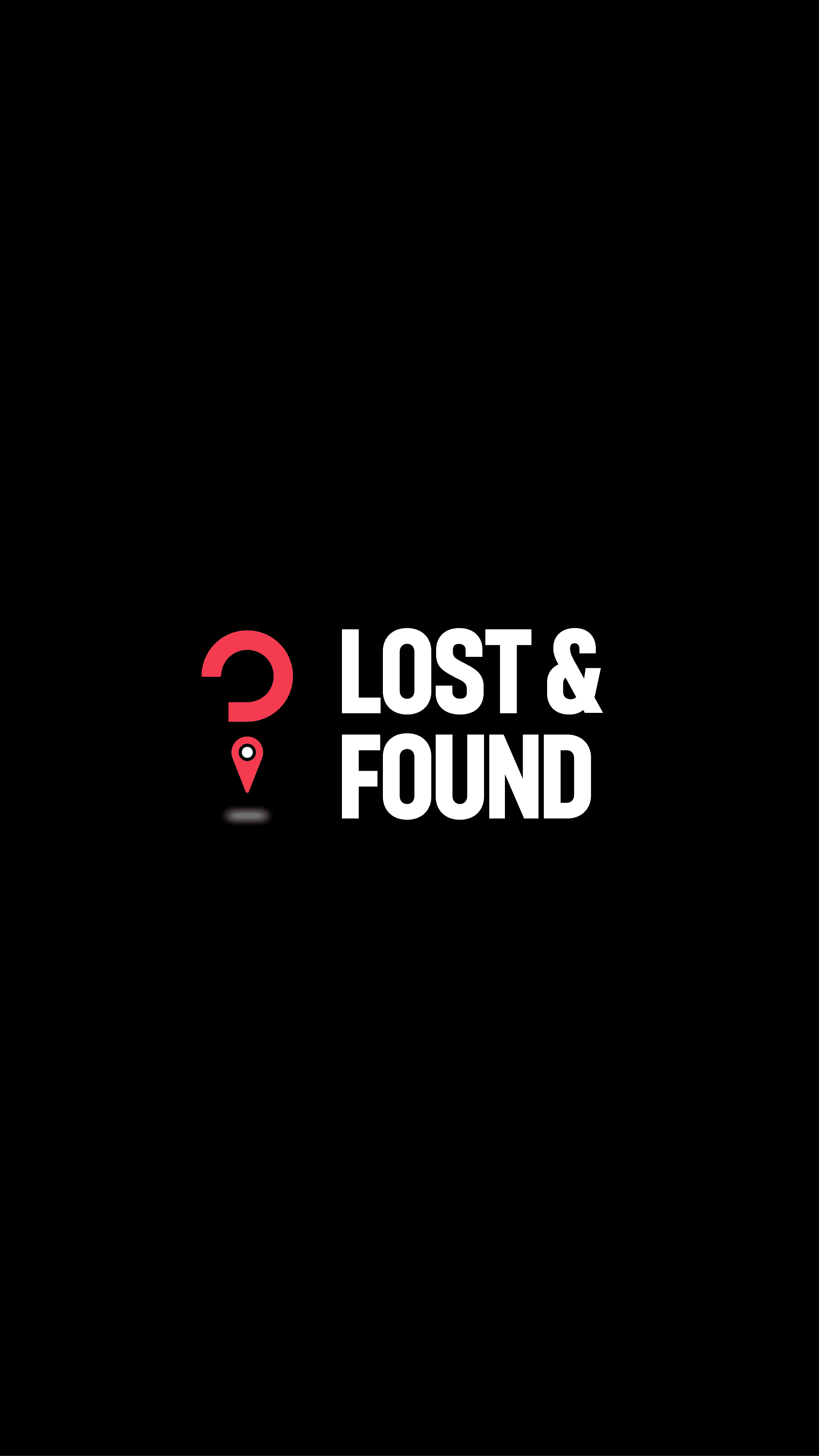
Lost & Found
A visual identity that symbolizes discovery, connection, and the return of what’s missing. The design balances simplicity with depth, making it versatile for modern branding.
Year :
2024
Industry :
Community / Technology
Client :
Lost & Found Organization
Project Duration :
6 Days
Problem :
Losing personal belongings can be stressful, frustrating, and time-consuming. Most people don’t know where to start when they misplace something important, and businesses or communities rarely have a system to manage found items effectively. Traditional “lost and found” setups, like notice boards or small boxes in offices, are outdated and limited in reach.
Lost & Found wanted to build a modern, accessible platform that allows people to easily report lost items and broadcast them to a wider audience. Along with digital reach, they needed a brand identity that instantly communicates trust, clarity, and action — one that looks credible on both digital platforms and physical materials like posters, tags, and stickers.
Solution :
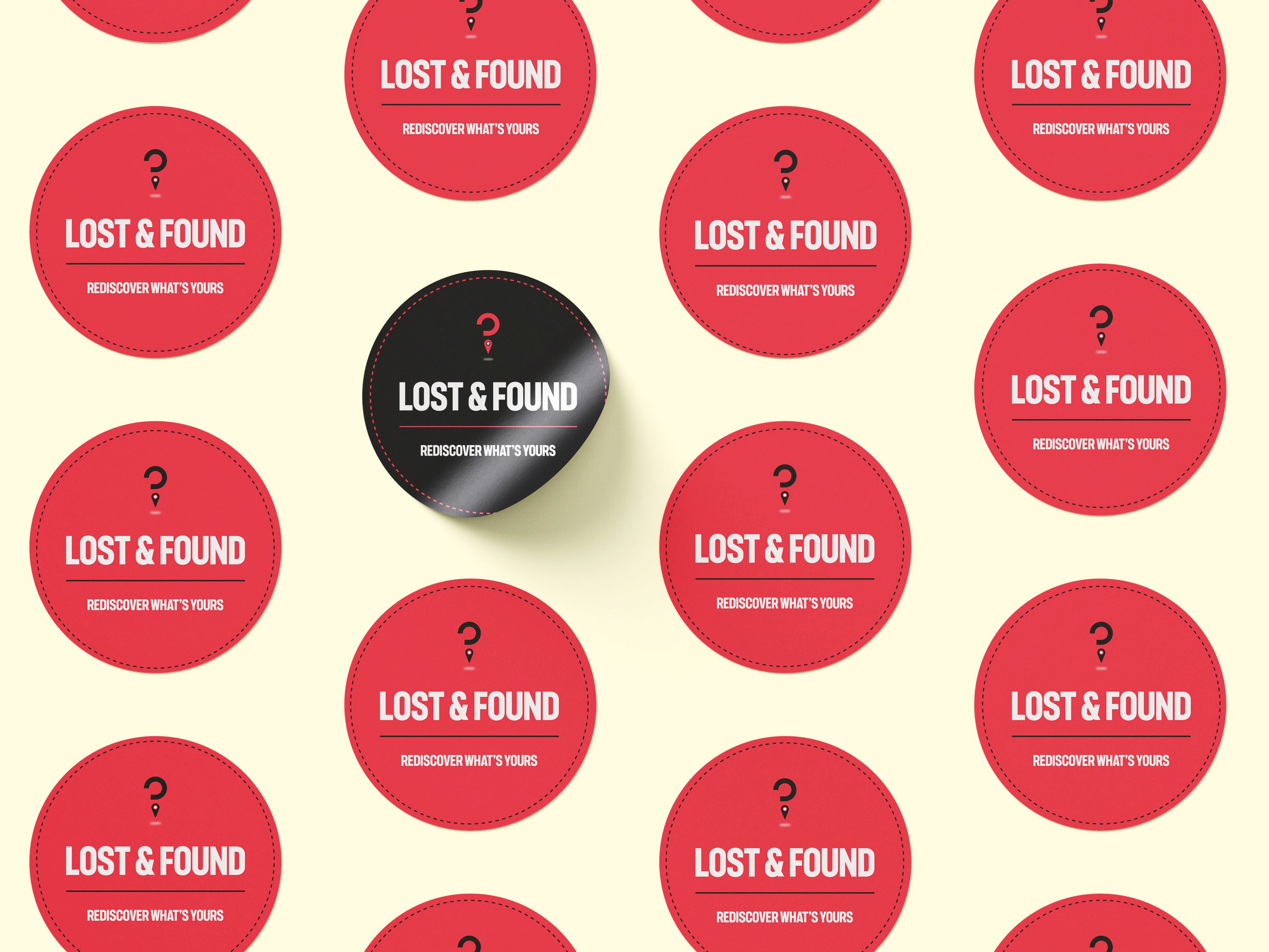
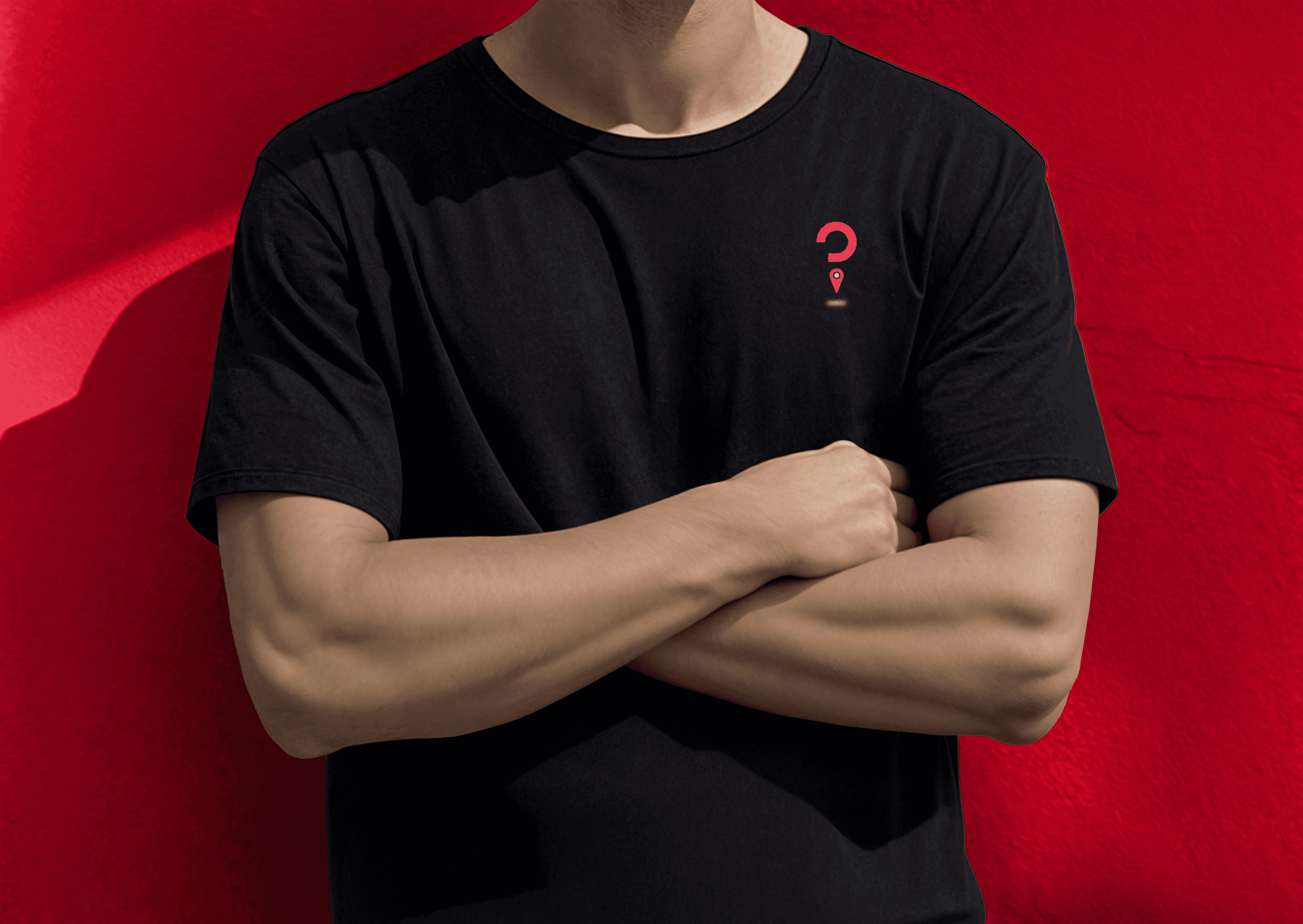
I designed a bold and memorable brand identity centered on the theme of search and recovery. The logo combines a question mark and a location pin — two universal symbols that together represent “something missing” and “where it is found.” This visual metaphor makes the brand instantly recognizable and easy to recall.
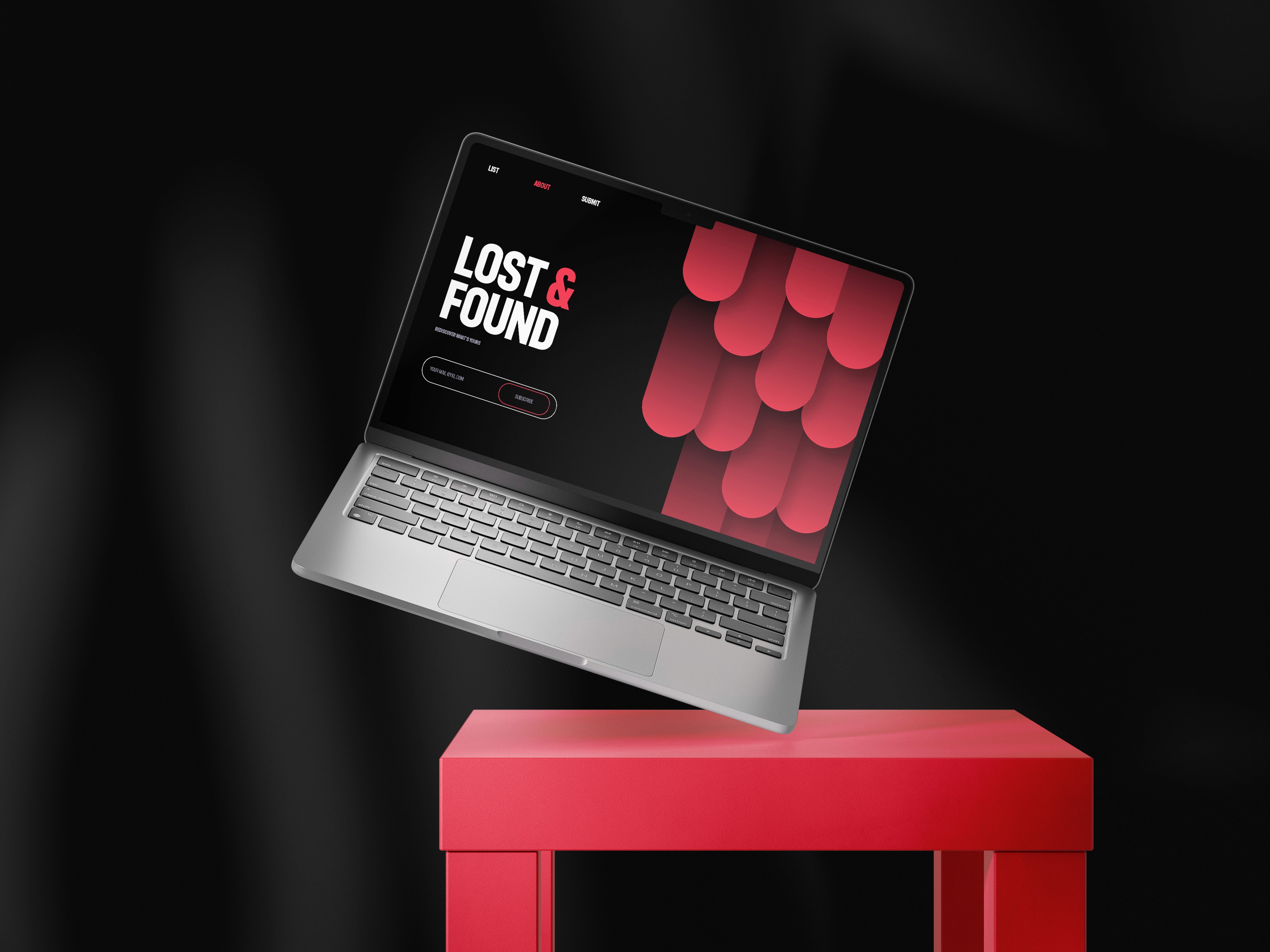
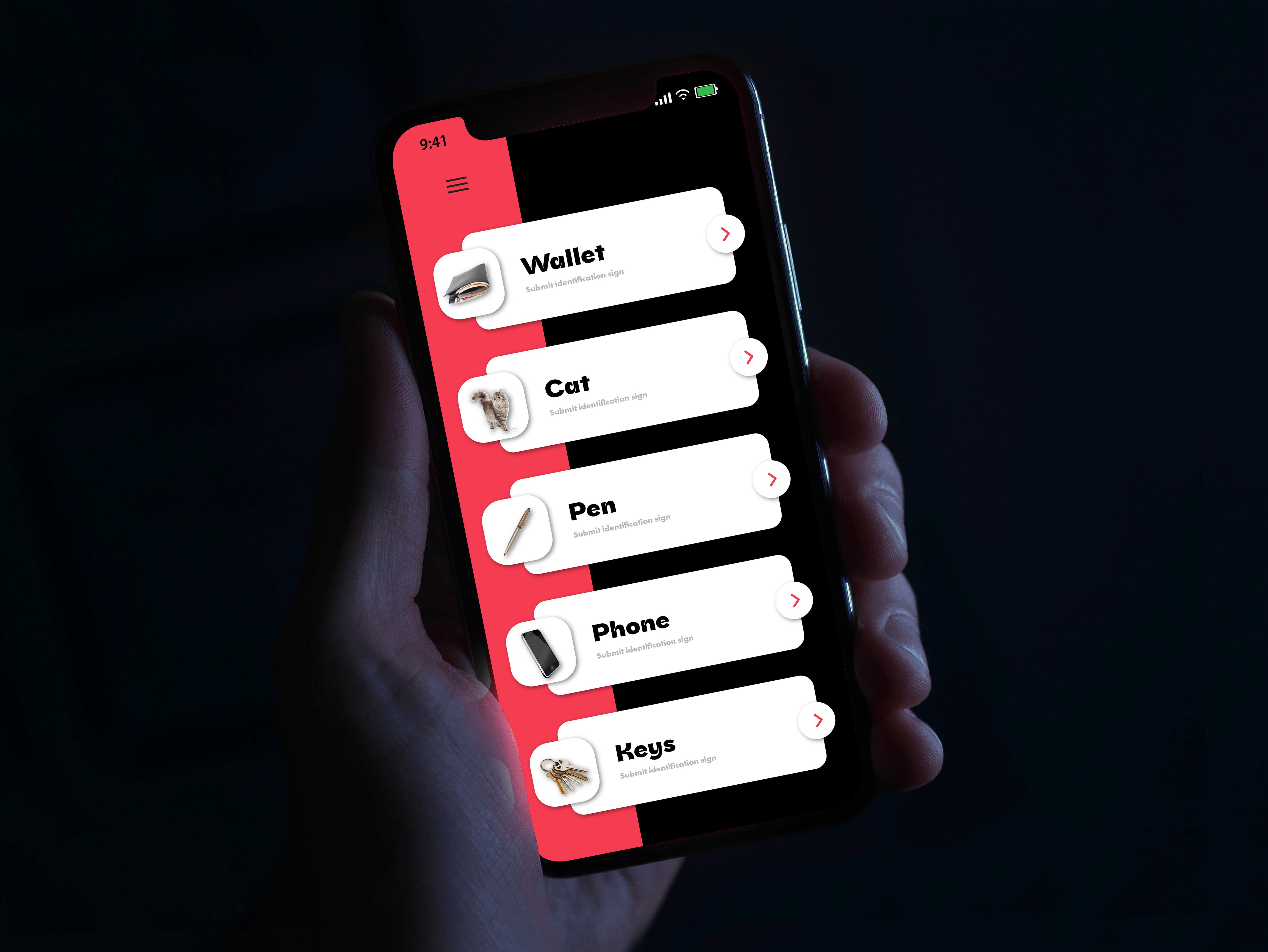
The color scheme features vibrant red for urgency and visibility, paired with strong black and white for clarity and professionalism. The identity adapts seamlessly across different applications:
Mobile and Desktop Apps – Clean, minimal interface icons.
Tags and Stickers – Clearly marked, durable, and instantly associated with the brand.
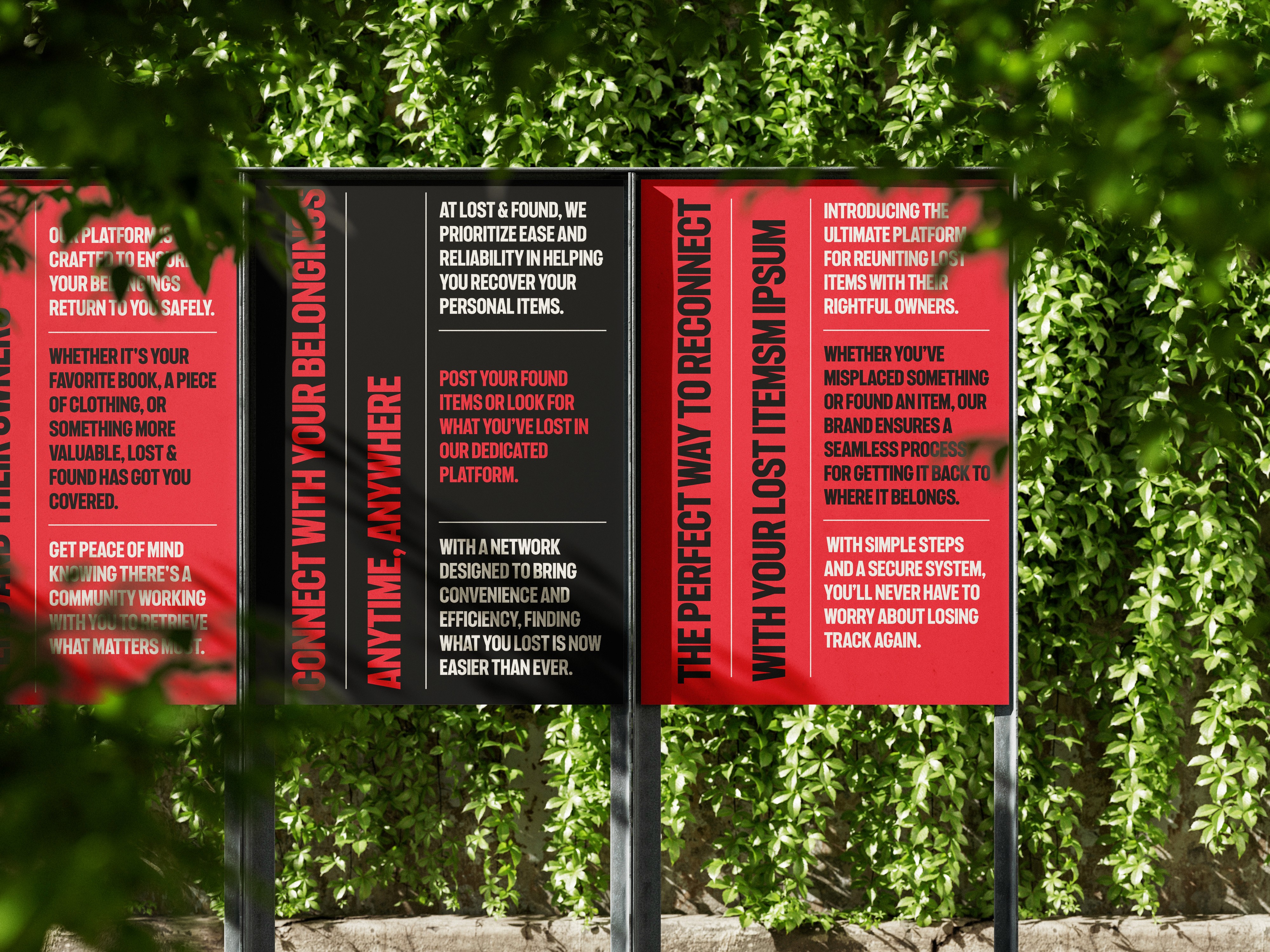
Posters and Campaign Graphics – Bold typography and visuals that catch attention in public spaces.
Merchandise (like T-shirts) – Simple yet striking, reinforcing brand presence.
This cohesive design system ensures Lost & Found maintains consistency whether on-screen or out in the real world.
Challenge :
The main challenge was balancing seriousness with accessibility. While the brand deals with lost belongings — often important or sentimental — it needed to feel approachable rather than corporate or intimidating. Achieving this balance required:
Crafting a logo that was simple but symbolic without overcomplicating the message.
Choosing colors that convey urgency without creating stress.
Designing for both digital and physical contexts, ensuring visibility whether on a phone app or a printed tag attached to an item.
Another challenge was scalability — the brand had to remain effective and legible across small stickers, large posters, and digital screens alike.
Summary :
The Lost & Found identity bridges community support with modern design. By combining a strong symbol, bold colors, and versatile applications, the brand makes it easier for people to reconnect with their belongings. The design is not just a logo but a trust signal — assuring users that they have a reliable system to turn to when something goes missing.
This project highlights how thoughtful branding can transform a simple service into a recognizable, impactful movement that builds confidence and community trust.
More Projects
Branding
Lost & Found
A visual identity that symbolizes discovery, connection, and the return of what’s missing. The design balances simplicity with depth, making it versatile for modern branding.
Year :
2024
Industry :
Community / Technology
Client :
Lost & Found Organization
Project Duration :
6 Days
Problem :
Losing personal belongings can be stressful, frustrating, and time-consuming. Most people don’t know where to start when they misplace something important, and businesses or communities rarely have a system to manage found items effectively. Traditional “lost and found” setups, like notice boards or small boxes in offices, are outdated and limited in reach.
Lost & Found wanted to build a modern, accessible platform that allows people to easily report lost items and broadcast them to a wider audience. Along with digital reach, they needed a brand identity that instantly communicates trust, clarity, and action — one that looks credible on both digital platforms and physical materials like posters, tags, and stickers.
Solution :
I designed a bold and memorable brand identity centered on the theme of search and recovery. The logo combines a question mark and a location pin — two universal symbols that together represent “something missing” and “where it is found.” This visual metaphor makes the brand instantly recognizable and easy to recall.
The color scheme features vibrant red for urgency and visibility, paired with strong black and white for clarity and professionalism. The identity adapts seamlessly across different applications:
Mobile and Desktop Apps – Clean, minimal interface icons.
Tags and Stickers – Clearly marked, durable, and instantly associated with the brand.
Posters and Campaign Graphics – Bold typography and visuals that catch attention in public spaces.
Merchandise (like T-shirts) – Simple yet striking, reinforcing brand presence.
This cohesive design system ensures Lost & Found maintains consistency whether on-screen or out in the real world.
Challenge :
The main challenge was balancing seriousness with accessibility. While the brand deals with lost belongings — often important or sentimental — it needed to feel approachable rather than corporate or intimidating. Achieving this balance required:
Crafting a logo that was simple but symbolic without overcomplicating the message.
Choosing colors that convey urgency without creating stress.
Designing for both digital and physical contexts, ensuring visibility whether on a phone app or a printed tag attached to an item.
Another challenge was scalability — the brand had to remain effective and legible across small stickers, large posters, and digital screens alike.
Summary :
The Lost & Found identity bridges community support with modern design. By combining a strong symbol, bold colors, and versatile applications, the brand makes it easier for people to reconnect with their belongings. The design is not just a logo but a trust signal — assuring users that they have a reliable system to turn to when something goes missing.
This project highlights how thoughtful branding can transform a simple service into a recognizable, impactful movement that builds confidence and community trust.